Wednesday, April 29, 2015
Microaggression
I experienced mircoaggression in middle school. I helped a friend with a math question, but he was still unclear about it. So I took the question step by step and explained it to him until he finally understood it. He looked at me and said, "Why are you so smart?" I looked at him and shrugged my shoulders and pushed the worksheet back to him. Another guy in the room next to us said, "Because she's Asian. All Asians are good at math." Since then I knew of the automatic label Asians have. I have been more conscious on how well I perform in math because I'm afraid that if I perform poorly, I'm not "Asian" anymore which is a large part of my identity.

Friday, March 13, 2015
Book Covers
1)


2) 5 Book Covers



I really like The Kite Runner because of the journey of the servant boy, whether it is with status, or moving to a completely new country. The cover on the right was the one I read(in Contemporary Literature). The cover does capture the storyline and mood because it is very dull where in the book there was war and discrimination. It is also an image of the setting. However, I like the cover on the right a little better because it is bright, which makes me want to read the book. The book was about a boy's journey, so having the servant boy and his friend/master was more fitting for the situation. Yes, there was a dark mood in the story, however, they are kids, and Kite Running is a very fun Afghan tradition. So I feel the brighter, more colorful cover is a little more suitable.
2) 5 Book Covers
I like this book cover because it is simple yet complex. It looks simple, but with the title and image, there seems to be pain and deep emotions in the book. The lock is very makes s avery bold statement because it is unlocked. For the title to be "Faithful" and the lock, unlocked, tells me someone is not faithful which makes me want to read it. This caught my attention because the lock and title as in the middle of the page.
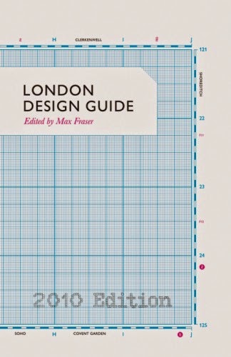
I find this book cover very creative. The image on the side looks like a kind of plan, and the alignment to the left makes it seem like there is more to the design. The font is simple, so it does not divert my attention from the detailed background.
The glasses caught my attention because it was so large and the only image on the cover were the glasses. Then I noticed the colors in the lens and feel like I am looking into someone else's life. I feel like this book is going to be about life and its reasons, and I like these books. Overall, I like the complexity of the glasses(details) yet the simplicity of the entire cover.
I find this book cover similar to the book cover with a design draft on it. There are some measurements which makes the cover look creative and make me wonder why it is needed. I also find it clever that the title is in a box and the title has "orders" in it. Moreover the background is cardboard, which makes everything fit under the theme of packaging. The slant of the cardboard tells me the book is more casual.
The crow caught my eye, and after readin/seeing the title, I liked how easy it was to understand because it was obvious the bird was a crow, yet it was still well thought out. The title itself is fun to read and look at. Because the title was so smart, there only needs to be the title and the author on the cover. The light pink background tells me the book is not 100% horror/thrill, rather just eery, or not scary at all.
I noticed that I tend to like simple yet well thought out covers because it makes me look at the the cover more, and slowly I will look at the details. It is best when there is only one focal point or even object because then I focus on one thing. What is more important is what I can learn about the book through the cover. When a cover is interesting, I look at it more and then I will start to analyze it, and predicting what the book will be about. Therefore the covers I chose are simple yet complex. Lastly, I realized the titles are either in sans serif or modern typeface rather than decorative to emphasize my like for simplicity.
The difference between these covers are colors and what it tells me about the book. And only the last cover plays with the title. Overall, I feel that my covers have very similar aspects.
Thursday, March 12, 2015


Friday, February 27, 2015
Logo Reflection
The most challenging aspect of creating my logo design was getting the letters to look neat and smooth. Because I was creating letters with the microphone cord, I had to use anchors and manually make the curves. That was already very difficult because everything had to look straight and uniform. As I changed the curve thickness and distortions later during the process, I found that just because it looked okay with one setting(thickness) it may not look okay in another. So every time I changed something, I had to readjust the curves so there are no sharp edges peeking out.
I overcame this challenge by being patience because there were no shortcuts available. So every time I tested out a change, I had to patiently readjust the the letters. It was frustrating at first, but overtime I was able to alternate curves and anchor faster. I learned that if an anchor is not working out, the best bet for me is to add an anchor next to it and delete the previous anchor. This can help smooth out my design.
The most successful aspect of my logo was the shade/gradient on the microphone. I spent a long time on it. Not only did I create gradient separably on the mic and handle(bottom part of the mic), I also created gradient on the out line to make the mic look more 3D. The casual line/curves on the top also adds a cartoonish/ casual look to the mic which is suitable for both the club and logo.


I overcame this challenge by being patience because there were no shortcuts available. So every time I tested out a change, I had to patiently readjust the the letters. It was frustrating at first, but overtime I was able to alternate curves and anchor faster. I learned that if an anchor is not working out, the best bet for me is to add an anchor next to it and delete the previous anchor. This can help smooth out my design.
The most successful aspect of my logo was the shade/gradient on the microphone. I spent a long time on it. Not only did I create gradient separably on the mic and handle(bottom part of the mic), I also created gradient on the out line to make the mic look more 3D. The casual line/curves on the top also adds a cartoonish/ casual look to the mic which is suitable for both the club and logo.
Thursday, February 26, 2015
My Mid-Winter Recess...
My break was really boring. Before the break, my friends and I were planning on going to a karaoke place over the break. However, there was so much to think about, the price, times open, times available, song choice, age limit, neighborhood etc. We were unable to pick one place to go to so it was canceled. So throughout the whole week, I stayed home watching dramas and volunteered on Friday, at a cat shelter like I normally do.
The most interesting part was Chinese New Year. We made a large dinner on Wednesday with so many foods I do not get to eat on a daily basis. Then on Thursday(Chinese New Year) my family and I went to my grandma's place to visit her. And that's the end... I continued to watch dramas after returning home.

The most interesting part was Chinese New Year. We made a large dinner on Wednesday with so many foods I do not get to eat on a daily basis. Then on Thursday(Chinese New Year) my family and I went to my grandma's place to visit her. And that's the end... I continued to watch dramas after returning home.
Monday, February 2, 2015
Museum Experience
I went to The Museum at FIT. The exhibition displayed various pieces like purses, dresses, skirts,and written drafts. This particular dress caught my attention. Around the dress there were both drafts and copied dresses. To the right of the dress there is a licensed copy of the Pierre Balmain evening dress. This evening dress has a similar feather design. The next dress to the right of this dress is another unauthorized copy of a dress. One the other side of the dress I find interesting were four sketches of coats and dresses designed around 1950s.
The dress which attracted me was a licensed copy of Pierre Balmain's "Angel" evening dress. The feathers are hand applied. I was drawn to this piece because of how light and it looked. Despite it being designed during late 1940s, it looked like a dress that can be worn today. This piece reminds me of a wedding gown because of its layered fabric and feathers. COmpared to the more high class or vintage looking pieces I found this piece more "soft" to the eye like a princess of a fantasy.
I did not know anything about the piece prior because I do not research about fashion so I did not know who Pierre Balmain. However, from the exhibition, I learned that a Cuban department store named Orcilia created the copy of this dress. Cuba was the 2nd largest importer of couture after U.S. at the time of when the dress was created which was from 1946-1947.

The museum did not allow any type of photography or video so I brought the brochures as proof that I went to the museum.

This was the notes I took at the exhibition.

Tuesday, December 23, 2014
6 Typefaces

This is a slab serif typeface and it used to advertise. I found it on a magazine. I do not feel the type faced is the best choice because it looked very plain. Because it is a "luxury" there should be a more luxurious type rather than slab serif. But, it is appropriate because thinking in perspective, simple typefaces on the cover would not crowd and overwhelm the reader. I also noticed that under the slab serif typeface is the sans serif typeface.

This is a sans serif typeface and it is a brand near my school. Like the first example, the logo is very clean-cut which is suitable for the products it is selling. SAFAR aims towards business men who have clean and simple looks, like the sans serif, There is nothing excess sticking out but plain and simple.

This is a modern typeface and it is a brand. It was in a magazine perfume sample. The typeface is very suitable for the purpose especially because it is for a high-end brand. The typeface used as a brand is very eye catching because of the thick and thins of the letters. This adds to the high class sense of the perfume being sold.

This is an old-style typeface and it is the the name of an organization. I found it on my library card. It is appropriate for its purpose because it is legible. As a large organization, the typeface suggests how old the library system is. The website, www.nypl.org,is in sans serif to create a straightforward, easy to read website.

This is a decorative typeface and it is the name of a store I saw near school. It is appropriate for the purpose because it is not a high class store. With round and fun letters, it attracts everyone/ average citizens to enter. I noticed that under "flavors" are the san serif typeface. Contrasting with the store name, it acts as a general description to what the store's goals are.

This is a script typeface and it is the name of a company. I found this in my wallet(card). It is appropriate for the brand and card because it makes the company and chocolate look very elegant. I noticed there was also the sans serif typeface which like the logo before acts as a description to the store and what the card is for.
Friday, December 19, 2014

Club Questions
1)what is the purpose of vocal club?/what does the club in intend to provide?
2)what symbol or idea do you think is the best representation of the club?
3)what is your favorite part of the club?
4)Who can join? Any past experience needed?
5)what message do you hope to send with vocal club?
6)what are the goals of the club?
5)what message do you hope to send with vocal club?
6)what are the goals of the club?
The purpose of vocal club is create a safe environment for the student body to express themselves through singing. Its goal is to provide a stress-free area, so at the end of academics students can go to vocal club to release stress. There is not experience needed. Students must have interest in singing because members are sincerely intrigued by vocal music. This is not to say that the club is limited to what students can do as long as it is related to singing. What makes vocal club different is that it is not competitive, rather over time, there are is friendships created. Symbols that most represent the club are the microphone and music notes because with the goal of performing at the showcase, microphone symbolizes the we intend to come in contact with to perform. A music note represent music, it does not have to be instrumental but also vocal because like the high and low notes of instruments there are high and low notes of the vocals. There is not favorite part of the because the club as a whole is the favorite club. Moments include sing ing a song like "Lean On Me" as a group as well as singing to the club and receiving feedback. Both strengthens the connections we have. Overall, as a club we want the school to know that if you are interested in singing and want to share your talent or just have a good time singing, vocal cub is the right place to go, for it is a no-judgement area; feedback we offer to song performances are critical but non-judgmental. Dont' worry, ff you mess up, we encourage you to go on!
What's my Typeface?

Tuesday, December 16, 2014
Logos I Like
.jpg)
The logo to the left is the album color of a korean band, Big Bang. I find this clever because they have always been an edgy group with a very strong color blocking style. In the album there is also a theme of snow. The local displays the edginess of the group with sharp corners of the logo and contrasting colors. The theme of winter/snow is displayed the the stone like back ground and blue log on top because together it seems "stone cold." In the album, each song has a separate logo, one being Fantastic Baby(right). Big Bang was able to maintain its edgy and color blocking style which I really like.
 I like this logo because it is able to incorporate its ideas into the organization's name. This emblem logo includes symbols/pictures that represent "motion" which I find really clever. The contrast between bright pink and white is very simplistic, putting focus on the actual logo. Not only is the name unique but the logo is unique as well.
Thursday, December 11, 2014
Portrait Transformation
Before:


After:

I started with the image of the subject and changed its dimensions and ppi. Then I added many layer masks(curves) to achieve the effect of natural lighting shining on her right side. I also made her left side dark to create the contrast. Then I used the the magnetic lasso tool (adding to and subtracting from selection) to cut her out of the original. After finding the background picture, I decided I needed other adjustments like changing the brightness. I copied and pasted the cut out image/subject onto the background and changed her size, opacity to erase her and made it seem like she is hiding. I repeated this four more times.
My concept is nature and becoming part of nature. The peekaboo action was meant to make nature look fun. The subject is really comfortable in nature and therefore is sort of playing hide and go seek with the audience. Her size does not overpower the background image, therefore not taking away it influence. Her being encompassed in grass and trees makes the environment seem very friendly and welcoming.
Friday, November 21, 2014
GIF

After completing the project, I feel most confident with the paint brush tool. This is because I used the tool the most; I created the head for the symbol's headphones and music notes by drawing and erasing, which gave me a lot of practice with the paint brush tool. To me, the paint brush tool is a helpful tool and changing its paint brush size and opacity was easy. I also learned to color hard to reach places in my symbol by simply putting the paint brush on top of a specific area and clicking the mouse a couple of time to get a dark enough colour. I did this very often for my own symbol. Also, I understood that the paint brush tool is very tedious to use, so I found that making short strokes helps a lot more than making a continuous long stroke because when you make a mistake and undo the mistake, it will undo the entire line that you have spent time trying to perfect. Overall I feel like I am most confident using the paint brush tool because it is easy to understand and I have used it for most of my symbol.
I wish I were better at the pen tool. I did use it a few times to create the straight lines for the music sheets next to the earphones however it was a struggle for me because I did not know how to create lines that were equal in size nor did I completely understand the usage of the new layers added. In terms of the layers, I learned to merge them to create one layer that I wanted. But in terms of creating a straight line, I am still struggling to achieve what I wanted to achieve. I thought that it would be easier to create these music sheet minds, however, it took me long time to understand how the pen tool is used and I am still now having trouble understanding how you can create one straight line without pressing another area and having the two- dots connect with a curve.
I would like to create a picture from various images on Photoshop. I have seen online of very interesting pictures of images that seem to have been pasted on another background image to create a new emotion or idea. I find this very interesting and would like to see how one can achieve this. Right now, I am thinking, in order to achieve this type of image you would have to use the lasso tool. But I do not know how to take the background off of an image. And would like to learn how to do so.
The concept of my symbol is music. This is shown with the headphones because we use headphones to listen to music. But a deeper idea I want to convey is that music can bring people together and does not discriminate. I show this by starting the project with a circle. Rather than using a rectangle or triangle, or angular shapes, a circle is a shape that seems like it can hold on to everyone and gather everyone so that no one is left out in a corner. I also wanted to show that music inspire others. I showed this by having a small music sheet come out of the headphones, showing that music not only are in your ears but goes out into the world because it affects not only you but also others. Lastly, a personal concept that I decided to include was that music brings me happiness. With the smile I wished to convey that music brings happiness to me. This is because songs are able to speak out my emotions and make me feel like there's someone who understands my emotions. This, makes me feel happy.I also enjoy singing, so when I listen to music I relate it to positive thoughts. Lastly, my choice of the color, yellow, was also to express the emotion of happiness. I felt that yellow was bright and brings a warm tone because it reminds me of the sun. So I felt like yellow was the most appropriate color for my symbol, whether it was for the smile or the music notes.
I felt like this project taught me a lot about Photoshop, which I have always been wondering about.
Monday, October 27, 2014
.gif)

Tuesday, October 21, 2014
Concept Board and Summary
.jpg)
Research
Michael Biuret- His artworks caught my eye because he uses mainly typefaces which made him unique compared to other designers and artworks I was looking at. I feel like his pieces are very shape and bold, especially the black and white ones.
Realism- I like this movement because it portrays real life. It is almost like a picture but just of everyday incidences which I find very simple.
Surrealism- This movement revolves around the idea of a dream and reality, having both realistic and nonrealistic factors in the piece.I am interested in the movement’s strive to push past the boundaries of art. This movement allows me to see what new ideas there are. I feel that every piece is going to be a unique and eye-opening piece.
Surrealism(Summary)
The surrealism movement was founded in the 1920s in Paris. Cubism and Dadaism have similar ideas in that they focus on the creation of the unknown. Dadaism is the predominant influence of Surrealism because it promotes new and unique ways of thinking. While Dadaism focuses on the disliking of wars and protests, surrealists found interests in the idea of different point of views in everyday aspects of life, but in less violent ways. Surrealism revolves around the idea of dream and reality by having both realistic and nonrealistic factors in the piece. Surrealists strive to convey and reveal our true thoughts disregarding any reasoning from the surrounding world. This fantasy based reality was able to influence many graphic designers to create pieces that are not only unusual but interesting to the eye. Graphic design reaches to surrealism to convey a message where an image can make the audience think in a new way, for example, in advertisements. Many graphic design advertisements strike at people because it looks so different, the world then turns to the advertisement and try to decipher and find the intelligence behind the advertisement. Moreover, the putting together of different objects or ideas and coming together with a concept allows people with a new way to think. Automatically, through one image, people gain a new understanding and point of view. Because of the possibilities that surrealism brought, the graphic design world has so much more space to expand on. Graphic designers was able to learn to accept what is unusual and accept the fantastical images they see in their minds and share it with others because it is such a clever point of view. With surrealism, graphic designers ultimately saw many new ways to convey an idea with it being overwhelmingly influential because it is so different and attractive.
http://www.arthistoryarchive.com/arthistory/surrealism/Origins-of-Surrealism.html
http://www.theartstory.org/movement-surrealism.htm
The surrealism movement was founded in the 1920s in Paris. Cubism and Dadaism have similar ideas in that they focus on the creation of the unknown. Dadaism is the predominant influence of Surrealism because it promotes new and unique ways of thinking. While Dadaism focuses on the disliking of wars and protests, surrealists found interests in the idea of different point of views in everyday aspects of life, but in less violent ways. Surrealism revolves around the idea of dream and reality by having both realistic and nonrealistic factors in the piece. Surrealists strive to convey and reveal our true thoughts disregarding any reasoning from the surrounding world. This fantasy based reality was able to influence many graphic designers to create pieces that are not only unusual but interesting to the eye. Graphic design reaches to surrealism to convey a message where an image can make the audience think in a new way, for example, in advertisements. Many graphic design advertisements strike at people because it looks so different, the world then turns to the advertisement and try to decipher and find the intelligence behind the advertisement. Moreover, the putting together of different objects or ideas and coming together with a concept allows people with a new way to think. Automatically, through one image, people gain a new understanding and point of view. Because of the possibilities that surrealism brought, the graphic design world has so much more space to expand on. Graphic designers was able to learn to accept what is unusual and accept the fantastical images they see in their minds and share it with others because it is such a clever point of view. With surrealism, graphic designers ultimately saw many new ways to convey an idea with it being overwhelmingly influential because it is so different and attractive.
http://www.arthistoryarchive.com/arthistory/surrealism/Origins-of-Surrealism.html
http://www.theartstory.org/movement-surrealism.htm
Wednesday, October 8, 2014
Good Graphic Design


This is an example of good graphic design because of the font and image. The font looks very fun and casual so you know the shop holds something you can enjoy. The image is simply a cupcake which means the shop sells cupcakes and the color makes the eating experience seem very fun. Yum! I would like some cupcakes.
Location:111 E. 23rd Street
Between Park Ave S. & Lexington
New York NY 10010
Saturday, October 4, 2014
Letter Project Reflection


1)Describe your process when creating your letter project. How was the process helpful or not so helpful to you?
I started the project with twenty thumbnail sketches at which I chose two to draw on half a sheet of paper. I then asked people of which on they like more and because my other design did not look like my letter, I chose the one I created for my final. For the final piece, I created a boarder and sketched a basic "P" shape on a piece of copy paper. I then put that piece of copy paper under the tagboard and placed it on a window so the light will allow me to trace the "P" as for the final piece. I started lightly sketching the scene on the tagboard because I did not want harsh outlines, I wanted the colors to create each part of the piece not the outlines. I especially did not want the the outline of the "P" to show because I wanted the scene to make up the "P." Afterwards, I used water color to color the piece and layers light background colors with darker colors. Lastly I used color pencils to add details to make the scene more vivid and erased the boarders to complete the piece. The overall process was helpful in that I worked my way toward the final piece and each step was done in order, for example, I made sure I sketch everything before painting and painted before I used color pencils. However, one particular part of the process that I did not find as helpful was drawing the twenty thumbnails. When I was thinking about this project I knew my concept and the basic ideas. But other than the two or three thumbnails I was sure I would choose from, I also had to think of thumbnails that I drew but knew I would not use which took up some time.2) How did you arrive with your concept/idea for your letter? How did you represent this concept visually in your design? (Give 2 examples)
I thought of my letter before me concept because I felt that what I related to my letter was unique. I chose a "P" because it was the first letter in personality and I feel like I have a weird personality, and not in the good way. I'm not quirky or jolly all the time, rather I am an introvert. It takes me a long time to warm up to someone and when I am in an area of many people, I something just want peace and quiet. And what brought me peace and quiet was nature; I feel that nature is a part of the world taken for granted because it gives me a rush of peace. Although I have never sat on grass and looked out to a river or pond I, imagine that to be a great scene to enjoy some peace, away from the busy city. I chose the scene to be a night view because I feel night brings more relaxation to me that the morning. For the morning is bright and busy with life where at night, its cool and quiet all around. Even animals awake at that time seem more at peace. I represented this concept both through color and my use of watercolor. The colors I chose were all the cool colors like blue, green, and gray. There were no reds or yellows in my piece which helps convey the calm emotion which is part of my personality. I used watercolor because I feel like watercolor brings a softer color. the water can easily create a very soft color so that I can layer colors on top of it. Also I feel like it was because I used watercolor that when you stand far from my piece that you really see the entire scene and not each stroke of the paintbrush form up close.
3) What was the most challenging aspect of this project for you? Why?
I feel like the most challenging aspect of this project was using the watercolor. Although at the end I feel that I was able to create a decent piece with the watercolor and was able to create the piece imagined, I had difficulty controlling where each color would go. For example, when I added to much water, when it went on my paper, it did spread which I had to quickly soak up, I also has trouble filling in details with the watercolor. For example, it was difficult for me to fill in the lines between clouds to create the outlines of the clouds which I had to pay much attention to and later ended up creating some details with color pencils.
4) Are you satisfied with your project? Explain your answer.
I am satisfied with me overall project in that I successfully created a piece and am able to convey the calm and relaxing emotion that I wanted to convey. This is because I felt my use of color choices were was suitable for my conept. One thing I am not satisfied with is not being careful enough with the watercolor. As I answered for the last question, I found the watercolor hard to handle and therefore did make a mark on my paper, If I was more knowledgeable about watercolors and more careful with them , I would have had a piece with 100% clean borders.
5) If you can change anything about your design, what would you change or do differently?
If I were to do something differently next time, I would be more careful with the watercolors. I feel that in that way I would be able to paint a scene that has clean boarders and therefore a cleaner presentation. I would do this by make sure I do not try to rush and flick my brush my accident more use appropriate brushes for clearer and more vivid images.
Friday, October 3, 2014
Inspirations?


Puppies and babies! I love them so much that they inspire me! They are so small/young, so they deserve, at least at a young age to stay healthy. Seeing healthy or unhealthy animals and babies inspired me to help them and work to make their lives better. This is one reason I have been pursuing a medical career whether it is a nurse or a doctor. I want to be able to assist them during their early stages of life and allow them to grow up as healthy as they can. Being able to see smiling babies and playful puppies are the dreams of anyone working in their respective fields. Seeing videos of these puppies and babies tell me how many of them need help so I definitely strive to provide them with the help they need.
Friday, September 19, 2014
Who am I?
Hello! I'm Wendy and I am a senior in high school. I do not have anything too special about to talk about but... here it goes. I am not a sporty person because I do not enjoy the sensation of sweating. Although I have friends who love sweating and feeling refreshed, I do not like how it sticks to my clothes. So, I tend not to run or play sports. As for things I do like to do, I do like to sing. I enjoy using the voice to express the emotions of a song. My favorite music would be Chinese and Korean(K-pop!) music. Although, I can rarely reveal my one favorite song because I listen to so many, I do have favorite tv-shows which would be: a Korean show called Running Man and another Korean show called Roommate. This does not mean I do not watch American tv-shows and listen to American songs, I'm just less exposed in the American... "area." Lastly, I feel that the purpose of the blog is to open up one window in my life and share that glimpse of life to others. Although this is not the first time I've blogged, I still feel kind of awkward. I guess I end the post here! Until next time...
Subscribe to:
Posts (Atom)