

I really like The Kite Runner because of the journey of the servant boy, whether it is with status, or moving to a completely new country. The cover on the right was the one I read(in Contemporary Literature). The cover does capture the storyline and mood because it is very dull where in the book there was war and discrimination. It is also an image of the setting. However, I like the cover on the right a little better because it is bright, which makes me want to read the book. The book was about a boy's journey, so having the servant boy and his friend/master was more fitting for the situation. Yes, there was a dark mood in the story, however, they are kids, and Kite Running is a very fun Afghan tradition. So I feel the brighter, more colorful cover is a little more suitable.
2) 5 Book Covers

I like this book cover because it is simple yet complex. It looks simple, but with the title and image, there seems to be pain and deep emotions in the book. The lock is very makes s avery bold statement because it is unlocked. For the title to be "Faithful" and the lock, unlocked, tells me someone is not faithful which makes me want to read it. This caught my attention because the lock and title as in the middle of the page.
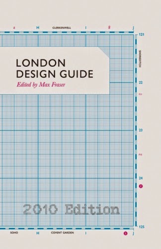
I find this book cover very creative. The image on the side looks like a kind of plan, and the alignment to the left makes it seem like there is more to the design. The font is simple, so it does not divert my attention from the detailed background.

The glasses caught my attention because it was so large and the only image on the cover were the glasses. Then I noticed the colors in the lens and feel like I am looking into someone else's life. I feel like this book is going to be about life and its reasons, and I like these books. Overall, I like the complexity of the glasses(details) yet the simplicity of the entire cover.

I find this book cover similar to the book cover with a design draft on it. There are some measurements which makes the cover look creative and make me wonder why it is needed. I also find it clever that the title is in a box and the title has "orders" in it. Moreover the background is cardboard, which makes everything fit under the theme of packaging. The slant of the cardboard tells me the book is more casual.

The crow caught my eye, and after readin/seeing the title, I liked how easy it was to understand because it was obvious the bird was a crow, yet it was still well thought out. The title itself is fun to read and look at. Because the title was so smart, there only needs to be the title and the author on the cover. The light pink background tells me the book is not 100% horror/thrill, rather just eery, or not scary at all.
I noticed that I tend to like simple yet well thought out covers because it makes me look at the the cover more, and slowly I will look at the details. It is best when there is only one focal point or even object because then I focus on one thing. What is more important is what I can learn about the book through the cover. When a cover is interesting, I look at it more and then I will start to analyze it, and predicting what the book will be about. Therefore the covers I chose are simple yet complex. Lastly, I realized the titles are either in sans serif or modern typeface rather than decorative to emphasize my like for simplicity.
The difference between these covers are colors and what it tells me about the book. And only the last cover plays with the title. Overall, I feel that my covers have very similar aspects.
I like the second and third book covers the most! I like how they're simple, yet creative. I chose simple book covers, too ^ - ^
ReplyDeleteI like the third book covers because it is simple but at the same time eye-catching. I like how there is an tree image inside the glasses.
ReplyDelete